Content Types
Content types are tools to help web authors break up, emphasize, and organize content in a more engaging manner. Below are examples of each Content Type available for CC's website.
Standard Web Page Content
Your standard text box. You can also add images, videos, hyperlinks, google calendars, and basically anything you can upload to or embed into Cascade. This is also where you would create tables for course grids or schedules. If you are copying and pasting something into here, make sure to first paste it in a generic text editor like NotePad or TextEdit. Copying and pasting directly from your email or Word document causes some weird things to happen as random bits of formatting code get added on. We are working on a way to make this not happen, but in the meantime please paste in NotePad or TextEdit beforehand. Alternatively, you can turn on "paste as text" which is located under "edit" in the top right of your text box toolbar in Cascade (this will remove most formatting styles such as bold or italics as well as any tables you have created).
Accordion
show all / hide all
Card Deck
Card Deck Label
Further text inside
This was the "CC - Card Deck" widget in dotCMS.
While you can cram as much stuff as you want in here, beware there's a lot of formatting with card decks that we cannot control. Card decks also make for a great template for reusable content.
also keep this short
You add everything that you could add in the standard content container. Obviously, this is a much smaller space, so it's recommended that you don't add anything larger/more complex than a logo image or simple picture. The WES logo is a good example.

card icons make things fun
Event Listing
More EventsForms (PLEASE use Clive)
To set up a clive form, contact the web paraprof. We HIGHLY discourage using third-party embedded forms because those always get lost and become inaccessible when the person who made that form leaves CC.News Listing
More StoriesThe Spring issue of the Bulletin is out!
Read More
Winter Issue of the Bulletin Available Online
Read More
CC’s Block Plan Celebrates 50 Years and Counting
Read More
Check Out the Summer 2020 Bulletin Online
Read More
Grass Roots
Read More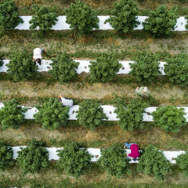
Our Work Toward Becoming an Anti-racist Institution
Read More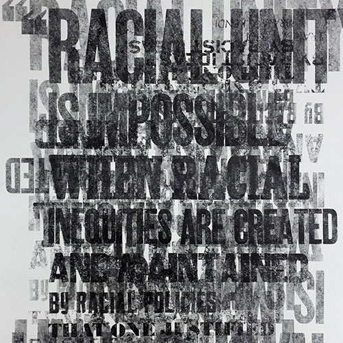
Photo Gallery
Profile Listing
Selected News Stories
More StoriesL. Song Richardson Named Colorado College’s 14th President
Read More
Inequality in the U.S. Class Featured on 'The Nod'
Read More
Inaugural Stroud Scholars Rise to Challenge
Read More
Opening Convocation Kicks Off 145th Academic Year
Read More
Side-by-side text content
Left Content.
You can also have 1/3-2/3 split. That can be used to create more detailed profiles/bios with a small image.
Video
This is the "Associated Text" and is like the description box under YouTube videos. Associated Text has more options than Caption in Cascade.


![Please fill out the caption with a concise description <span class="cc-gallery-credit">[John Doe]</span>](../../stateoftherockies/_images/2006-cover.png)
